


Time for a change.
The client request was for an evolution not a revolution. A name change. Fresh colors. An inspired logo design and a brand manifesto that helps align their many affiliates across the county.
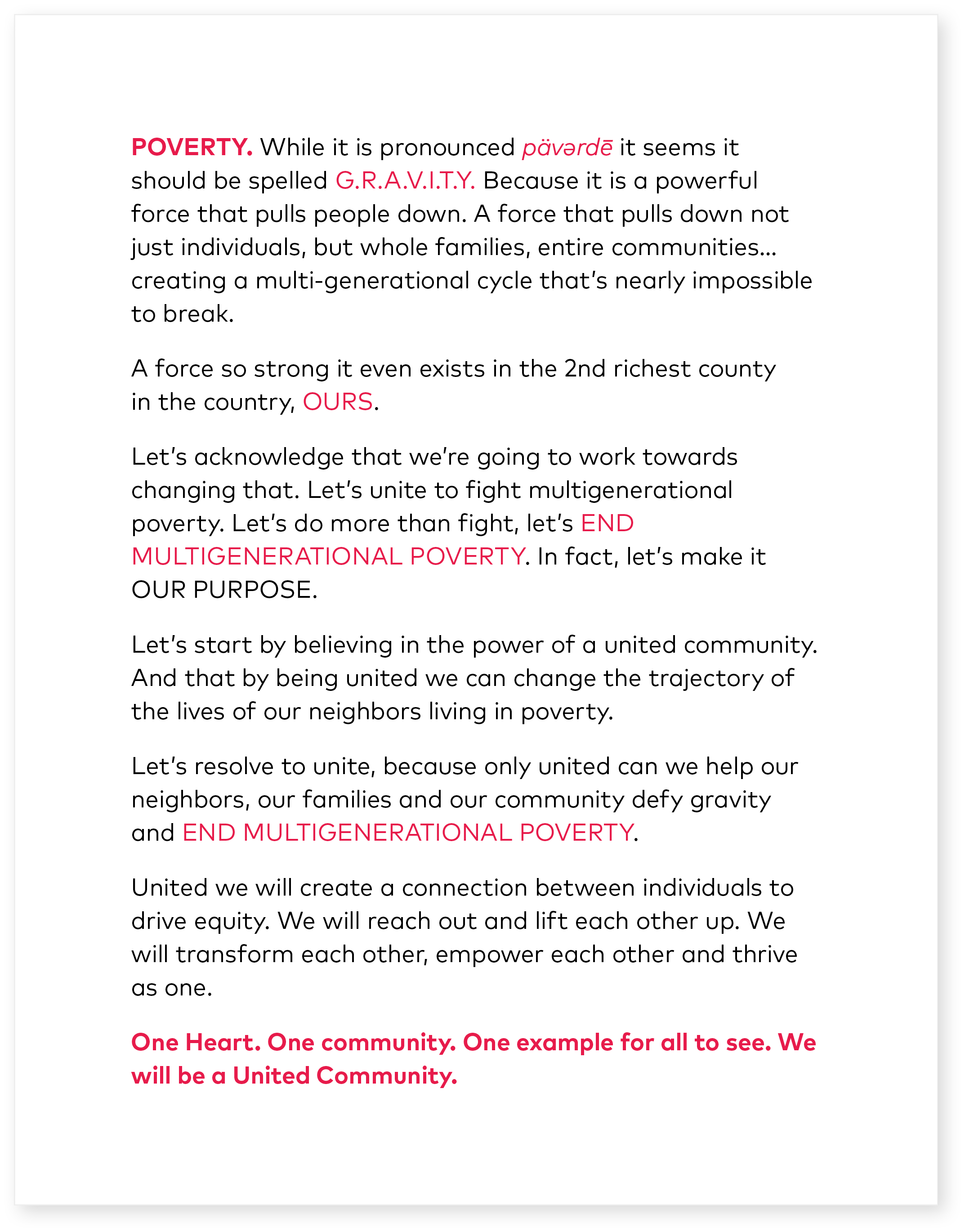

The red in the logo represents United Community’s energy, determination, boldness, and enthusiasm to accomplish its mission. The “i” in United and the “i” in Community are connected to form an arch, symbolizing momentum, connection, bringing people together from a variety of backgrounds with the common goal.
